Brand system
MenuFramer logo
The mark, wordmark, badge and lockups, and the type and colour tokens — rendered from components/brand/logo.tsx. Import the components; the kit at the foot of the page is for surfaces that can’t run React (email, print, third parties).
LogoMark
The mark on its own — a thin-stroke M framed by two quarter-arc corners, one over the top right and one under the bottom left. It fills with currentColor, so it inherits the surrounding text colour and adapts to light and dark without a variant. The artwork is square (26×26) — size it by height with h-* w-auto and the width follows.
import { LogoMark } from "@/components/brand/logo"

<LogoMark className="h-6 w-auto" />          // inherits text colour
<LogoMark className="h-6 w-auto text-primary" />  // or tint it
LogoBadge
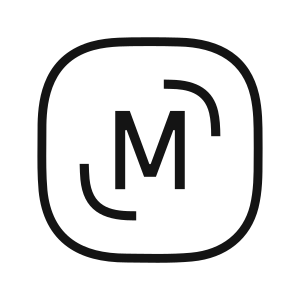
The same mark, contained — cream on the brand rounded square, with its own background and hairline. Use it on photography, or on any surface where a bare mark wouldn’t hold contrast. Colours are fixed, so it does not follow the theme. It is the exception, not the default: every first-party surface — header, footer, auth, the guide — uses the bare mark. Contained and simple are one path, so there is nothing to keep in sync between them — but the favicon is separate artwork (app/icon.svg, replaced 2026-08-25). Same mark, different container: a white card around a near-black square rather than this gradient. It holds its own copy of the path, so a change here does not reach the browser tab.
import { LogoBadge } from "@/components/brand/logo"

<LogoBadge className="size-9" />
Wordmark
“MenuFramer” as artwork. The F is a custom glyph — the crossbar sweeps down into the stem — so the word cannot be set in a font; it is one outlined path (WORDMARK_PATH), in currentColor like the mark. Its viewBox is the glyphs’ tight box, so the height you set is the cap height and the width follows at about 7.4×. It is decorative on its own — the lockup around it carries the name.
import { Wordmark } from "@/components/brand/logo"

<Wordmark className="h-3.5" />   // 14px caps; width follows
Logo / LogoWordmark
Mark + wordmark. Logo wraps it in a link; LogoWordmark is the bare lockup for use inside a trigger. Proportions come from the designer’s horizontal lockup: the wordmark’s caps stand 0.44 of the mark’s height, the gap is 0.19 of it, and the caps are centred on the mark. The badge lockup keeps the word at the same size as its simple sibling, so the header’s morph into the auth page never resizes the name.
When the lockup is drawn as a picturerather than set in a row — the footer mural, a social image, print — LogoLockupArt is one SVG at the designer’s exact ratios, so one fill and one mask cover both halves. Size it by width or height; nothing inside it needs aligning.
| Prop | Type | Default |
|---|---|---|
| size | "sm" | "lg" | "sm" |
| mark | "simple" | "badge" | "simple" |
| withWordmark | boolean | true |
| href (Logo) | string | "/" |
import { Logo } from "@/components/brand/logo"

<Logo />                          // sm, bare mark, links to /
<Logo size="lg" />                // header, footer, auth
<Logo size="lg" mark="badge" />   // only where currentColor can't hold contrast
<LogoLockupArt className="w-full" />  // the lockup as artwork (footer mural)
Sizing
Two lockup scales. Mark sizes below are heights — the artwork is square, so the width matches. The wordmark column is cap height. The mark holds down to about 16px; below that switch to the badge, which keeps its own contrast.
| Scale | Mark | Badge | Wordmark |
|---|---|---|---|
| sm | 28px | 32px | 12px |
| lg | 32px | 36px | 14px |
Type tokens
One family, three voices. Geist sets everything — display, headings, body and UI — and the display voice is the same face large, semibold and slightly tighter, never a heavier one. The font-display utility owns that weight (600) and tracking, so a call site never spells either out and the display voice stays one definition. In body and UI, prominence comes from semantic mutedness rather than weight. Geist Mono carries values. Reference the token, never the family name.
MenuFramer
--font-display
Geist
Display sizes — page headlines, hero titles. Large, semibold (600), slightly tighter. The utility sets weight and tracking; write font-display and nothing else.
MenuFramer
--font-heading
Geist
App-UI heading slot — card titles and section labels. Same family, whatever weight the component asks for.
MenuFramer
--font-sans
Geist
Body and UI. Prominence comes from semantic mutedness, not weight.
MenuFramer
--font-mono
Geist Mono
Values, numbers and identifiers, set as inline code.
<h1 className="font-display text-5xl">…</h1>
<p className="text-muted-foreground">…</p>   // font-sans is the default
<span className="font-mono">$14.50</span>
Typeset
Long-form prose — legal pages, FAQ answers, anything article-shaped — is styled by the typeset system (ported from shadcn/typeset, adapted to the tokens; see app/typeset.css). Wrap the content in typeset plus a voice preset and author bare semantic markup — no classes on headings, paragraphs, lists or tables. Embedded components opt out with not-typeset. Everything below carries zero classes:
A heading owns the space below it
Body copy runs at the container’s size with a reading leading. Inline semantics need no classes: strong emphasis, stress, a link in the prose voice, a highlight, inline code, and a keyboard key like ⌘K.
Lists and structure
- Markers are muted; the text carries the ink.
- Nested rhythm stays tight
- without any spacing utilities.
A blockquote leans on a hairline, nothing louder.
| Preset | Voice |
|---|---|
typeset-notes | 18px / 1.9, full ink — the reading voice (/terms, /privacy, this specimen) |
typeset-faq | 15px, muted — accordion answers under a 16px trigger |
<div className="typeset typeset-notes">
  <h2>Section</h2>          // bare markup — typeset styles it
  <p>Prose…</p>
</div>
Colour tokens
The chrome uses the standard shadcn semantic tokens, defined in app/globals.css and resolved per theme. Reference the token, never a hex. A restaurant’s own accent colour is set per-tenant at runtime, so it isn’t a brand token.
| Token | Usage |
|---|---|
--background | Page background |
--foreground | Body text |
--primary | Primary actions, brand chrome |
--primary-foreground | Text/icons on --primary |
--secondary | Secondary surfaces and buttons |
--muted | Subtle fills and section backdrops |
--border | Hairlines and dividers |
Constraints
- Colour comes from the parent. The mark and wordmark are
currentColor— set it with a text utility; don’t hardcode a fill. - Minimum mark height 16px; use
LogoBadgebelow that. - Never stretch the mark or the wordmark. Size both by height and let the width follow — the wordmark is about 7.4× as wide as it is tall, and a fixed width would squash the F.
- Clear space= half the mark’s height on every side.
- Don’t rebuild the lockup by hand or restyle the badge — import the component so spacing and motion stay consistent.
Brand kit
The designer’s full export, 38 SVGs in public/brand/kit/, for surfaces that can’t run React. Ink, cream, forest, orange and pink are the artwork’s own colours, not interface tokens — inside the product everything above draws in currentColor. The catalogue is lib/brand-kit.ts.
Wordmark
“MenuFramer” with the stylised F — a custom glyph, so the word is artwork, never type. In code it is WORDMARK_PATH.

Lockups
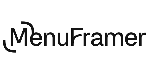
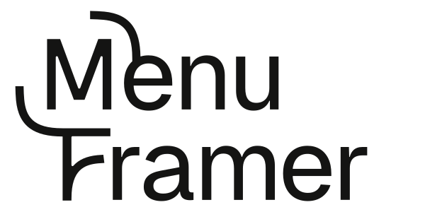
Mark and wordmark together. The horizontal lockup is the reference for how the two sit in the UI (LOCKUP in lib/brand.ts).



Mark
The framed M: a thin-stroke M with a quarter-arc over the top right and under the bottom left. Square. In code it is MARK_PATH, drawn in currentColor.


Tiles
The mark or monogram on a solid square. Social avatars, print, anywhere a bare mark would lose its edge.
App icons
Rounded-square icons with a baked-in drop shadow. Three cuts of the M: thin, regular, bold.

Monograms
Two MF monograms: one framed by the arcs like the mark, one solid with the wordmark’s stylised F, in light, medium, regular and bold cuts.